Front Cover
The front cover needs to be able to sell the magazine so uses many different ways to promote itself:

- Main image- this is the largest image on the page and usually reflects the image/mood of the magazine. Magazines often have the main image looking right at you, this is called direct mode of address.
- Masthead- this is also known as the title and is found at the top of the front cover, usually in a large font. The typography of the masthead has to reflect the genre of the magazine and has to be unique.
- Barcode
- Date and Price- the price of the magazine reflects the content (the magazine will be more expensive if there is more content- due to production value)
- Colour scheme- the colour scheme also reflects the mood and genre of the magazine.
- Taglines
- Positioning statement
- Buzz words- for example, Plus and Exclusive.
- Issue number- the issue number shows how established the magazine is.
- Inserted images- other images tell the reader what will be inside the magazine and often illustrate the coverlines.
- Promotional buzz words- for example, Free CD.
- Coverlines- lines of text that show what will be in the magazine.
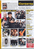
- Images- the images used on a contents page will relate to different articles and will also be beside the page number of that particular article.
- Columns- these columns are also broken into various sections; for example, News and Features.
- Note from Editor
- Text- the text found on a contents page is usually no more than 12pt (with the exception of subtitles/ column headings) because they need to fit on as much information as possible.
- Page numbers- found beside the article name or pictures relating to the article.
- Large image- there is often one large image used that will reflect the main article/ double page spread.

No comments:
Post a Comment