Wednesday, 29 September 2010

Photographs for School Magazine

In todays lesson we were given a camera and told to take the photographs for our front cover and contents page:

I will use this photograph of a sixth form student
on the front cover of my magazine.

I will use this photograph on my contents page to represent the
"Successful Summer Sports Day" article.

This photograph will also appear on my contents page to
represent the "Back to school blues?" article. (about how
to manage your time effectively.)

This photograph will represent the "Meet our new Head
Girl" article on the contents page.

This image will also appear on the contents page of my
magazine, it will represent the "New healthy lunch menu" article.

Tuesday, 28 September 2010

Rough layout of school magazine

Today we were also asked to make a rough sketch of what the front cover and contents page of our new school magazine will look like.

Front Cover                                             


Contents Page

Plans For New School Magazine

Today we began work on our preliminary exercise; this involves creating a front cover and contents page for a new school/college magazine. We began by creating a plan for our front cover:
Title: Focus (I chose this title because the magazine will focus on school events and it implies concentration.)
Positioning Statement: Highlighting the school events you care about
Mise-en-scene: i will be using a photo of a girl wearing school uniform and carrying a folder (medium close-up). The background will be the school corridor.
Coverlines:
  • "Top results for GCSE students"
  • "Meet our new Head Girl"
  • "In For a Change- a new school uniform is on its way!"
  • "Dates for your Diary"
  • "Year 12 trip to Barcelona"
  • "Successful Summer Sports Day- highlights from your week of competition"
  • "Exclusive! New Healthy Lunch Menu"
  • "Visit from author Anne Cassidy"
  • "Sneek peek! at Beauty and the Beast"
  • "Weatherhead raises £1000 for charity!"
For my second task I made a plan for the contents page of the magazine:
Regular Content:
  • "Who's done what?"- see what our pupils have been up to in their free time.
  • "What's new in school?"- up to the minute news on what is new at Weatherhead.
  • "Dates for your diary"- school events and holiday dates
  • "Recipe of the month"
  • "Which year group will win?"- find out what year group has been involved in the most school activities this month.
Feature Articles:
  • "In for a Change"- new school uniform article
  • "Meet our new Head girl"- interview
  • "Top results for GCSE students"
  • "Sneak peek at upcoming play Beauty and the Beast"
  • "Year 12 trip to Barcelona"
  • "Visit from author Anne Cassidy"- interview
  • "Successful Summer Sports Day"- highlights from the week of sport
  • "New healthy school menu!"
  • "Back to school blues?"- how to organise your school and home time effectively
  • "Could you be Weatherheads new superstar?"- news about the halloween talent show
Images for Contents Page:
  • Pupils taking part in sporting activities- Sports day article
  • Image of head girl- Interview with new head girl
  • Image from the school canteen- New school menu
  • Pupil wearing new uniform- New school uniform article
  • Image of a clock- Back to school blues? article

Camera Angles

For the past few lessons we have been studying the many different types of camera angles, and in yesterdays lesson we had the chance to practice using them. We were given a list of certain shots that we had to take using a particular camera angle; we then worked in groups of three to take the pictures around the school.


A low angle medium close up

         A high angle long shot            

An extreme close up of the time

A big close up of someone using a mobile phone

A close up of someone in nature

                  A two shot in medium long shot                    

An over the shoulder shot of someone writing

             A very long shot conveying isolation               

               A medium close up                      

                            A very long shot                           

An image with connotations of stress

An image with connotations of friendship

Thursday, 23 September 2010

Additional Codes and Conventions of Music Magazines

Music Magazine Front Cover

The masthead is usually only one word long, the full width of the page and positioned on the top left side of the cover. The title always uses a unique font and is the largest text on the page.

The main image is usually a medium close up of a band or singer; the picture often uses direct mode of address (they are looking at the reader) and it conveys an attitude and the genre of the magazine.

The main cover line
is the largest cover line on the page and will anchor the meaning of the main image. The other cover lines will give information about the magazine contents and are used to attract the target audience; these cover lines are often two or three words long.

There is only a few fonts used for the typography on the front cover and it is usually very consistent. The colour scheme of the music magazine only consists of a few colours.


Other features of a music magazine front cover include a positioning statement (found by the title), the issue number, date, barcode and price, puffs (usually offer something free to customers, for example, a CD) and occasionally smaller pictures are found on the cover that link to the coverlines.
In addition there is sometimes a strip at the top or bottom of the cover containing a list of bands/ artists/ topics that are featured in the magazine.


Music Magazine Contents Page

The contents page is usually split into columns with headings to divide up the contents; this often contains ‘Regular Content’ that is featured in every issue and ‘Features’ that are once only articles. There is often an editorial letter (accompanied by a photograph and signature), subscription details, the issue date and at the bottom of the page: the page number, website address and contact details.
Music magazine contents pages very often use a white background but use a consistent colour scheme (featured on the front cover); this page may also feature a repeat of the magazine title and include the word ‘Contents’.
Another convention of music magazine contents pages is the images used- there is one large image used and then a few smaller images, all of which link to the magazine articles; these images will also have the page numbers on them which will anchor them to the written content.


Music Magazine Double Page Spread
The double page spreads featured in music magazines are mostly set out in 3 or 4 columns and written in paragraphs with a quite informal tone- the article very often highlights the personality of the writer.

The headlines are creative and eye-catching and are usually in the same font as other text on the page; this headline very often bleeds across both pages. The standfirst is always found by the headline and before the start of the main text- it is used to introduce the article and works with the headline to inform readers what the article is about; it also usually uses a larger font than the rest of the article.
At the beginning of the text there is a drop capital featured so readers know where the article begins, they are usually in bold or in a bigger size text and drop down a few lines into the article.  

The main image very often takes up a whole page or more and relates to the angle that the article is taking. Double page spreads may also feature smaller images or drop quotes to break up the text and make the article more appealing to readers. Occasionally quotes may also be found beside images and link the photo to the text.
Double page spreads will also include a byline which tells the reader who the article was written by; the photographer will also be credited.
At the bottom of the page the page number, magazine title, issue date and occasionally the website will be found.

Wednesday, 22 September 2010

Codes and Conventions

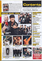
Today, after being given the outline of our coursework tasks, we worked in groups to discuss the codes and conventions of music magazines. My group was asked to analyse the front cover of MixMag and the contents page of Kerrang. We then discussed it as a class and came up with a list of the codes and conventions for music magazines.

Front Cover
The front cover needs to be able to sell the magazine so uses many different ways to promote itself:
  • Main image- this is the largest image on the page and usually reflects the image/mood of the magazine. Magazines often have the main image looking right at you, this is called direct mode of address.
  • Masthead- this is also known as the title and is found at the top of the front cover, usually in a large font. The typography of the masthead has to reflect the genre of the magazine and has to be unique.
  • Barcode
  • Date and Price- the price of the magazine reflects the content (the magazine will be more expensive if there is more content- due to production value)
  • Colour scheme- the colour scheme also reflects the mood and genre of the magazine.
  • Taglines
  • Positioning statement
  • Buzz words- for example, Plus and Exclusive.
  • Issue number- the issue number shows how established the magazine is.
  • Inserted images- other images tell the reader what will be inside the magazine and often illustrate the coverlines.
  • Promotional buzz words- for example, Free CD.
  • Coverlines- lines of text that show what will be in the magazine.
Contents Page
  • Images- the images used on a contents page will relate to different articles and will also be beside the page number of that particular article.
  • Columns- these columns are also broken into various sections; for example, News and Features.
  • Note from Editor
  • Text- the text found on a contents page is usually no more than 12pt (with the exception of subtitles/ column headings) because they need to fit on as much information as possible.
  • Page numbers- found beside the article name or pictures relating to the article.
  • Large image- there is often one large image used that will reflect the main article/ double page spread.