Tuesday 19 October 2010

Questionnaire

Yesterday I created a questionnaire that I could use to conduct my audience research; I wanted to find out people's opinion on the design, price, frequency of publication and content of music magazines so I could begin to make decisions for my own music magazine.
A copy of my questionnaire:
Questionnaire
1. What gender are you?
Male                 Female

2. What age are you?
10-15         15-20      20-30      30-40       40+


3. How often do you buy music magazines?
Every week            Every few weeks            Every month

4. Who is your favourite band or artist?


5. What three colours would you prefer to see on a music magazine?
Red      Orange     Yellow      Purple      Pink     Silver
Blue     Green       White        Black       Gold

6. What music magazines do you currently purchase?


7. What do you like/dislike about these magazines?


8. How much would you pay for a music magazine?
£1.50- £2.00        £2.00-£2.50        £2.50-£3.00        £3.00-£3.50

9. What features of music magazines do you prefer?


10. What artists/bands would you prefer to read articles about? (Please give 2 examples)


11. What item would you rather receive free with a music magazine?
CD         Poster

Thursday 14 October 2010

Initial Plans For My Magazine

Using the research I conducted into existing music magazines I began to make the initial decisions for my own music magazine:

Genre: Indie/ new music
Target Audience:
teenagers- young adults

Price: £3.50
Frequency of publication: My magazine will be published monthly.
Average issue size: Between 120-150 pages.
Regular content: Top 50 tracks of the month, new music releases, upcoming gigs, concert and music reviews, free poster.
Feature articles: An interview with an artist/ band, article about a "rising star", short interviews with artists/bands, festival review.

Wednesday 13 October 2010

Researching The Market Place

Today we began our main task; I conducted research into music magazines that could be possible competitors to my music magazine. For each existing music magazine I researched the price, frequency of publication, issue size, regular content and feature articles.

I researched NME, Q and Mojo because all three regularly focus on new artists and bands.


NME Magazine is published on Wednesdays weekly; each issue is £2.30. The issue size of the magazine is around 70 pages.
Regular Content of NME: gig guide, new music releases, this weeks top 20, concert and music reviews, fanmail and track of the week.
Recent Feature Articles: interviews with The Wombats, Katie White and P Diddy, feature on Mumford and Sons and Bob Dylan poster. This poster would also act as a puff on the front cover of the magazine.
The publisher of NME is IPC Media. http://www.ipcmedia.com/


Q Magazine is published monthly and therefore has a larger issue size of around 110-130 pages per issue. Each issue of Q is £3.90. Recent feature articles: celebration of John Lennon, interview with Damon Albarn and his Gorillaz and a feature on Foals.
Regular contents of Q include: Q50- the 50 essential album tracks of the month,  new releases, live concert, music and film reviews.
The publisher of Q Magazine is H. Bauer Publishing Ltd.
http://www.bauer.co.uk/


The price of Mojo magazine is £4.30 and is published monthly. The issue size of this magazine is around 150 pages. Recent Feature Articles include: interviews with The Stooges, MC5, The Incredible String Band and Judy Collins, and reviews of Kings of Leon, Elvis Costello, Bob Dylan, John Lennon and many more. Mojo regularly includes a free CD with their magazine, which will act as a puff on their front cover.

The publisher of Mojo Magazine is H. Bauer Publishing Ltd.
http://www.bauer.co.uk/ 

Tuesday 12 October 2010

Stages of Contents Page Production

I created my school magazine contents page on Quark Xpress and took screenshots whilst working to show the progress I was making. 


The first step I went through to make my contents page was uploading text from Photoshop; I created "Contents" on Photoshop as I needed to use the same typography as my masthead. I then uploaded the image of new school uniform as this would be the largest image on the page and relate to one of the feature articles.
I then added the section "Regulars" using size 11pt.


Secondly, I created two more of the column sections, "Features" and "Groups", using the same font style, size and colour as "Regulars".
I also uploaded another of my images, linking to the "Meet Our New Head Girl" article and added the page number in a contrasting colour.


Similarly I created my fourth section "Charity" and uploaded two other images that relate to particular articles, also adding the page number to show what page the article can be found on.


My final few steps included adding my final section "Review" and uploading my final image.

Stages of Front Cover Production

To create my school magazine front cover I used Photoshop; whilst producing my front cover I took screenshots of my work to show the different stages involved.

Firstly I uploaded my main image and adjusted it so that it was in a suitable place on the front cover.
I then created my masthead- I chose a font that would be unique to any other text on my page.


After creating my masthead I added my positioning statement "Highlighting The School Events You Care About", making sure to used a different font style and colour to my masthead. I also added my issue number, price and barcode.


I then added my main coverline "Top Results For GCSE Students" using quite a large font size so that the text would be more eye catching.


Finally I created my coverlines, for example "Year 12 Trip To Barcelona", using various font sizes and a colour that would stand out against the image. I also used buzz words such as "Exclusive".

Monday 11 October 2010

Evaluation of School Magazine


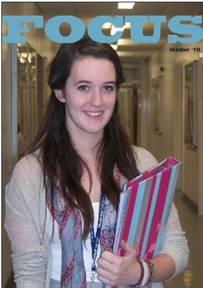
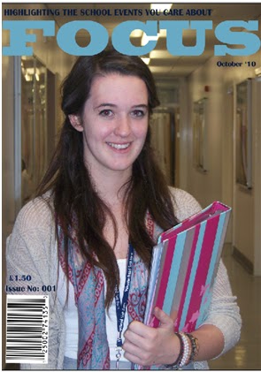
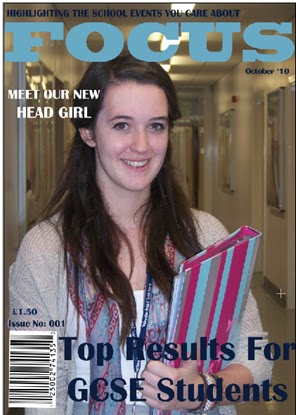
My school magazine front cover follows the codes and conventions of real media products as it uses a main image that reflects the purpose of the magazine; this image also uses direct mode of address and is the largest image on the page. My front cover also features a masthead at the very top of the page with a unique font. I have also used a barcode, the date, price and issue number. On the front cover of my magazine I have also used coverlines and buzz words such as “Exclusive” and “Sneak Peek” and a positioning statement located above the masthead- “Highlighting The School Events You Care About”. These features are all similar of real magazines.
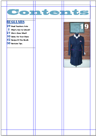
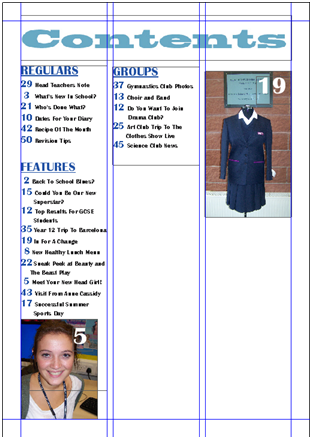
My contents page also follows the codes and conventions of real media products by featuring images that relate to articles in the magazine; these images also show the page numbers that the articles appear on. My contents page also uses columns to display the text- these columns are broken down into sections such as “Charity” and “Groups”, similar to real magazines that use sections such as “Gossip”. The text shown on my contents page, with an exception of the subtitles, is no more than 12pt and page numbers are found beside the article names.
The new media technologies I used in the construction of my school magazine are Photoshop and Quark Xpress; I used each programme for a different section of my magazine. Photoshop was used to create my front cover; the wide variety of fonts allowed me to use a unique typography for my masthead and I was able to edit, crop or cut out my main image.  I used Quark Xpress to create my contents page; this programme allowed me to use as many different columns as I wanted to display my text and also allowed me to import other images.
I think that one of the strengths of my new school magazine is the main image used; although I changed the image from my original plan I think that this image reflects the purpose and mood of the magazine. However, one of my weaknesses would be the background of the main image; if I had the chance to do this task again I would make changes to the mise-en-scene. Another strength is the images used on the contents page- they illustrate what will appear in certain articles and also show the page numbers of that particular feature. A second weakness of my media product is the colours of text used on my front cover- I do not think all of the coverlines stand out properly against the background, if I did this again I would choose a more suitable colour scheme.
Overall I think I worked quite well on the preliminary task and completed my work on time. Any mistakes that I have made throughout this task will help me to improve when working on my main task; I will also be able to use my new knowledge of Photoshop and Quark Xpress when working on this task.

Production of School Magazine Contents Page

For the past few lessons I have been working on the second task for my preliminary exercise. I have been using Quark Xpress to create my school magazines contents page; I imported my masthead from Photoshop and the images from My Documents, I then created the rest of the text on Quark Xpress.


When creating my school magazine contents page the only changes that I made from my plan was the layout of the columns. I also added a few extra article names to fill up the page; this is because there was quite a lot of space left after typing out my planned layout.

Thursday 7 October 2010

Production of School Magazine Front Cover

For the past few lessons I have been working on Adobe Photoshop to create the front cover of my new school magazine. Our brief outlined that we had to use a photograph of a student in medium close-up, some appropriately laid-out text and a masthead.

My School Magazine Front Cover:
I had to change my main image slightly from what I had planned in my rough layout; this is because I did not have enough time to arrange for a student to wear their old school uniform. Instead I decided to use a photograph of a sixth form student, however I did keep the rest of my rough layout how I had planned originally.

The colours I decided to use for the masthead and coverlines are colours that appear in my main image.