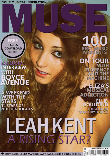
Here is my music magazine contents page:
Friday, 4 March 2011
Main Task: Final Product
Here is my music magazine front cover:
Here is my music magazine contents page:
Here is my music magazine double page spread:
Here is my music magazine contents page:
Thursday, 3 March 2011
Evaluation Question 4
Who would be the audience for your media product?
Factfile
Name: Nicole Morecroft
Age: 17
Lives with : Mum, younger brother
In her spare time: socialises with friends, attends gigs/concerts
Favourite Colour: purple
Favourite genre of music : indie
Favourite TV Programmes: FRIENDS, One Tree Hill
Favourite Artists: Florence and the Machine, Ellie Goulding
Favourite Subject: History
Hobbies/Interests: Fashion, music
Factfile
Name: Matty Parnell
Age: 16
Lives with : Mum, dad, brother
Spare Time: socialises with friends, goes to the cinema
Favourite Colour: blue
Favourite genre of music : indie
Favourite TV Programmes: Shameless
Favourite Artists: Mumford and Sons, Kings of Leon
Favourite Subject: Film Studies
Hobbies/Interests: Listening to music, playing sports
Wednesday, 2 March 2011
Audience Feedback
1. Do you think that the images and colour scheme reflect the genre of the magazine?
2. Do you like the main image on the magazine front cover?
3. Do you think the front cover would succeed in persuading people to buy the magazine?
The feedback I received for this question showed that people from my target audience believed my magazine would do well at persuading people to purchase it; they also said that they liked the coverlines used and that the cover had a very professional look about it.
4. Are you happy with the appearance of the magazine?
The 10 people I got feedback from said that they were reasonably to very happy about the appearance of my magazine and that they thought it looked exciting, eye catching and professional.
5. Do you think there are enough coverlines and other information on the magazine front cover?
6. Do you think the images on the contents page are appropriate for a music magazine?
7. Do you like the layout of the contents page?
The one person who answered no to this questionnaire said that they liked the content and images used on the page but suggested that I could have used three columns rather than two.
8. Is the text on the contents page suitable and easy to read?
All 10 people that I questioned about my product said yes they did think that the text was suitable and easy to read; they also told me that it was clear, in context with the genre and laid out well. However, one of the 10 chosen from my target audience suggested that maybe the text should be a little darker.
10. Do you think the style and colour scheme is consistent on both the front cover and contents page?
The 10 people questioned all said that they liked the the colours I have used and that they work well together; other feedback I recieved was that the style is nice and relaxed and that the colours used are not gender biased which makes the product accessible to all.
11. Would the layout of the double page spread encourage you to read the article?
The 10 people I asked from my target audience told me that they thought the layout of my double page spread looked very professional and eye catching; one person questioned also said that they liked the way that my headline was displayed.
The 10 people I asked from my target audience told me that they thought the layout of my double page spread looked very professional and eye catching; one person questioned also said that they liked the way that my headline was displayed.
12. Do you think there is enough content in the article?
The one person who answered no to this question said that they liked the layout and style of the article but suggested that maybe I could have included a third page or another image.
13. What do you like about my magazine?
The feedback for this question showed that people liked my magazine colour scheme, images, content and layout.
14. What would you change about my magazine?
The feedback for this question showed that improvements that could be made to my magazine included adding an extra page and/or image to my double page spread, and possibly adding more images to my contents page.
Questions for Audience Feedback
1. Do you think that the images and colour scheme reflect the genre of the magazine?
2. Do you like the main image on the magazine front cover?
3. Do you think the front cover would succeed in persuading people to buy the magazine?
4. Are you happy with the appearance of the magazine?
5. Do you think there are enough coverlines and other information on the magazine front cover?
6. Do you think the images on the contents page are appropriate for a music magazine?
7. Do you like the layout of the contents page?
8. Is the text on the contents page suitable and easy to read?
9. Do you think that the images reflect the corresponding articles well?
10. Do you think the style and colour scheme is consistent on both the front cover and contents page?
11. Would the layout of the double page spread encourage you to read the article?
12. Do you think there is enough content in the article?
13. What do you like about my magazine?
14. What would you change about my magazine?
15. Would you buy the next issue of my magazine?
Subscribe to:
Comments (Atom)


